


Adding a feature to an existing app.
Role
Research, UX/UI Designer
Tools
Figma, FigJam, GoogleSheets
Methods
User Research, Secondary Research, UI Design, Visual Design, Usability Testing, Prototyping
Timeline
4 weeks
Project Overview
GroupMe is a communication app that offers free group messaging and works on any device. Currently, it’s usage rank is #69 in the United States and #14 under the category of “communication” (similarweb). It was founded by Jared Hecht and Steve Martocci, being launched in August 2010 (Harvard Cap). The app was created to help people stay in touch. Users can join groups, message others, leave groups, create topics within groups, and more. People can also now send GIFs and videos.
The Problem
As people continue to desire to feel a sense of belonging, they are searching for ways to meet people and build connections in this more and more online world. They are looking for ways to do this efficiently and communicate with ease.
The Solution
A new feature that allows users to select their mode of reacting.


Research
Competitive Analysis, User Interviews
Define
Affinity Mapping, POV & HMW, User Personas
Ideate
User Flows, Task Flows, Features Set, Design Principles
Design
Sketching, Low-Fidelity Wireframes, High-Fidelity Wireframes, Interactive Prototype
Test
Usability Tests, Prioritizing Revisions, Iterations
Research
Research Goal
We want to know what users value when communicating with others through technology so that we can improve interconnectedness beyond in-person interactions.
Research Objectives
Determine what people look for when selecting the non in-person method of communication to utilize.
Understand what people value most when communicating with others.
Determine what are the highest priorities/what people value most in their experiences when selecting a communication platform to utilize.
Competitive Analysis
A competitive analysis was completed to understand the competitors and identify opportunities. I did some research into various communication apps. The primary difference that I noticed was that these competitors each had unique ways of engaging with messages. Currently, GroupMe’s primary way of engaging with a message is selecting the “heart” next to the message.

Strengths and commonalities amongst competitor websites included:
Can share information through multiple modalities (i.e. links, GIFs, images, etc.)
Can utilize video calls, record voice messages
React with various emojis
Cross-platform messaging services
Can create groups/threads
Weaknesses amongst competitor websites included:
Some device type constraints
Difficulties organizing group discussions on some apps
Some messaging screens are overly busy visually
Can be overwhelming to navigate with apps that have lots of features
User Interviews
I completed moderated phone call user interviews to gain a better understanding of what people value when utilizing communication apps. Some of the insights gathered are as follows:
Pain Points:
Too tired to respond on communication app
Get lost in group messages in certain apps
The UI of GroupMe is not aesthetically pleasing
Limited features on some apps- way of interacting (not very fun), others have too many features to the point its overwhelming and clutters the app
Hard to read emotions, body language through non in-person communications
Needs:
Can’t see tone very well in communication apps
More ways to express on GroupMe (reactions)
Difficulties uploading files to GroupMe
GroupMe is slow, seems behind the times
UI of GroupMe (placement of items) is not clean
Motivations:
Human connection/relatability
Understanding emotions of people in conversation, context of situation, topic
Desire to understand when people are confused or have questions
Get information across/receive information clearly
It was interesting to see participants’ responses as there were some overlapping/similarities between them. People's responses in regards to their experience with the GroupMe app seemed largely dependent upon the functions/purpose of the groups formed in the GroupMe- people's responses seemed to depend on whether their messaging/communication in GroupMe was for work purposes or social purposes and small or large group contexts.
Affinity Mapping
Through an affinity map, I further analyzed and synthesized the user interview information by categorizing their input to identify trends.

What are people saying?
6 out of 7 participants mentioned that communication preference is largely dependent upon context/person
6 out of 7 participants primarily engage with messages via text responding, reactions/tapbacks, and emojis
At least 4 participants mentioned that having the ability to react with emojis or tapbacks was one of the best features on communication apps
People prefer convenience, efficiency and versatility
7 out of 7 participants shared that the primary issues with the GroupMe app included: minimal reactions available/ways to express, delayed/slow responsiveness of the app itself, app/layout of messaging was not visually pleasing (UI design)
Pain points to explore:
Possible feature that focuses on expanding reactions/expression in communication on communication app
Possible feature with the layout of the messaging
POVs and HMWs
In synthesizing information from user interviews and the affinity mapping, inferences and hypotheses were created through Point-of-View statements and “How Might We”statements. These insights reflect the user needs.

User Personas
User personas were developed from my user interview insights and affinity mapping analysis. Two types of users were created: a super social individual as well as a goal/task oriented individual.

Feature Set
I developed a feature set based on the feedback from users in my research as well as competitive analysis and ranked the importance of each feature.
Must Haves
Reactions/tapbacks: Tapback of quick reaction options
Voice Message: Option to deliver a voice message (group/individual)
Video Call (individual chats): Live video calls with individuals
Come Later
Type of conversation selection: Ability to select purpose (work, social, family, international, etc.)
Threads: Smaller conversational topic threads on the same page (subtopics)
Read Receipts: See when a message was read (for groups)
Message Previews: See a small clip of a message via notifications to determine urgency of response
Remove Member: Relocate remove member option
Defining the Design Principles…
In summary from the research, I gathered 5 main design principles to cover the key aspects of my solution.

User Flows and Task Flows
A Task flow was developed to show the steps toward achieving a goal, interacting with a message.

A User flow was developed to focus on the user’s interaction with a message and where they would utilize the new feature in the process. In the user flow, I showed the various actions a user could potentially take. From there, I highlighted where my feature would have effect. Users would utilize my feature when they participate in either the individual or group chats.

Sketches: Low-Fidelity Wireframes
To get an idea of what this new feature would look like and how the user would interact with it, I first sketched my designs in low-fidelity wireframes. Initially, I had 3 sketches that included a “before”, “during” the interaction, and “after” the interaction. As this project progressed forward, my designs expanded significantly based upon feedback.

High-Fidelity Wireframes
The low-fidelity wireframes were then transformed into the high-fidelity wireframes. In this process as I continued to explore communication apps, I discovered more details that I was missing to make this feature a more seamless process.
Flow 1

Maintained the content idea of the word expression reactions and updated the visuals (added more customizability to the word expression selection).
Flow 2
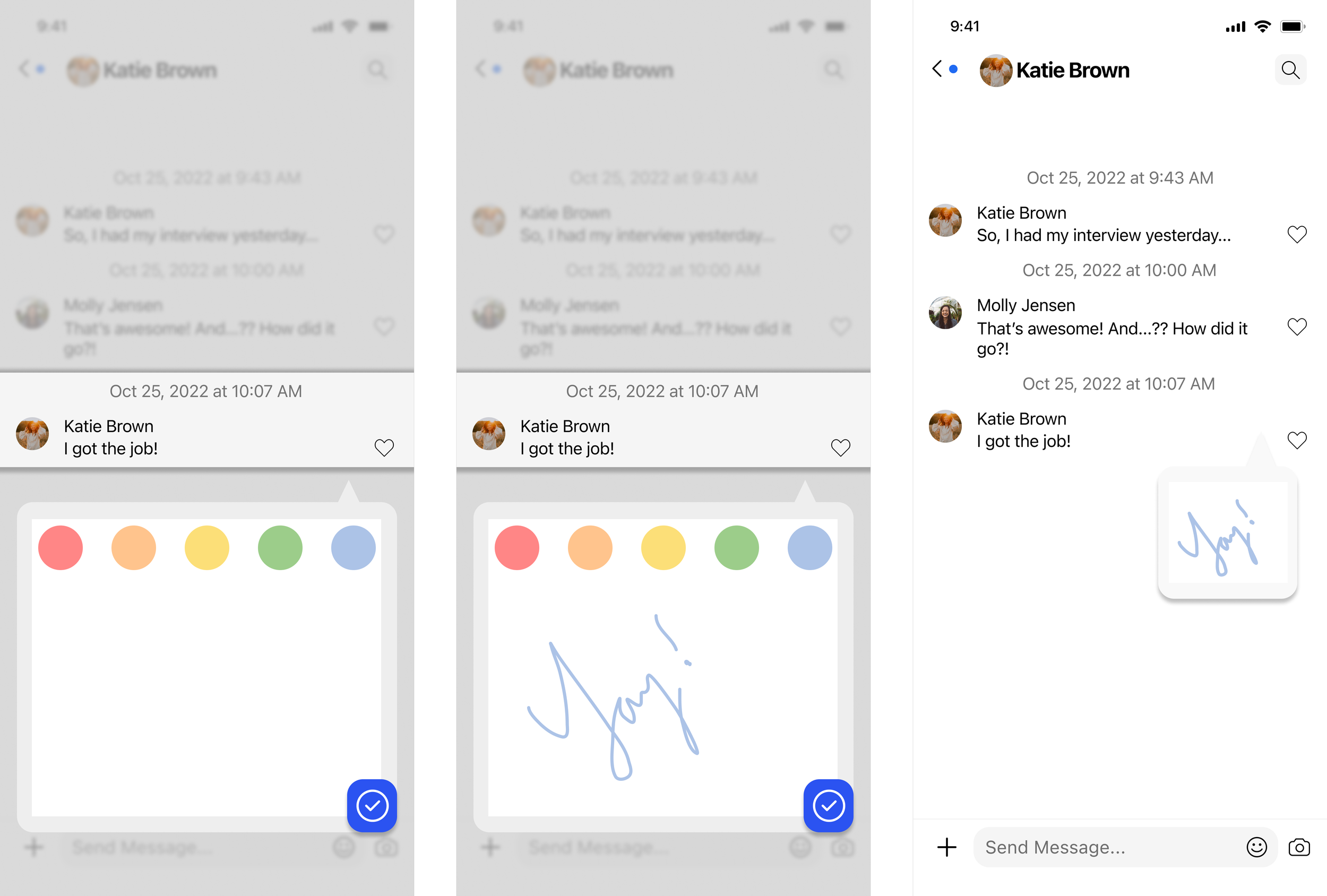
Created a second flow of drawing expressions so that users have options of how to react to messages.
Usability Testing
I conducted 5 moderated usability tests via google meet video calls with participants who were male or female and use communication/messaging apps. They all use the GroupMe app as well. My goal was to identify pain points/confusion that users encountered with the overall flow of the design. I also wanted to make sure the content was clearly understood and user friendly.
Feedback for “Words” Function
Ease of completion (1: easiest, 5: hardest)
4/5 participants rated 1
1/5 participants rated 3
Efficiency (5: least, 1: most)
3/5 participants rated 1
2/5 participants rated 2-3
Context for Use of Function
3/5 participants rated “social and work”
1/5 participants rated “social”
1/5 participants rated “work”
How Understood the User Felt (not at all, somewhat, I feel understood)
3/5 participants rated “I feel understood”
2/5 participants rated “somewhat”
Feedback for “Draw” Function
Ease of completion (1: easiest, 5: hardest)
2/5 participants rated 1
2/5 participants rated 3
1/5 participants rated 2
Efficiency (5: least, 1: most)
2/5 participants rated 2
1/5 participants rated 1-2
1/5 participants rated 4
1/5 participants rated 3-4
Context for Use of Function
5/5 participants rated “social”
How Understood the User Felt (not at all, somewhat, I feel understood)
4/5 participants rated “somewhat”
1/5 participants rated “I feel understood”
The main areas that needed revisions included:
Update the initial icon on the word/draw flow to make the function of the task more understood (to help make the first interaction more intuitive)- noted by 5/5 participants
Create a visual of what happens when multiple people use the feature to react (for word expressions and drawing flow)- noted by at least 2/5 participants
Make the color box’s function in the drawing expressions feature more identifiable- noted by 5/5 participants
Combine the two features- an option for either mode of reacting (gives more versatility and usability)


Key Takeaways
One of the biggest key takeaways that I learned was Context! Context! Context! So much of how people communicate through text matters by the context. Who they are speaking to, the setting of the conversation (work, social, etc.), the reason of conversation, etc. impacts how an individual interacts with a given message.
One of the challenges I faced in this project was creating a new feature for reacting when an amazing feature with engaging emojis already exists by other apps and works well. It was a great experience getting feedback from others as it can be seen that as my project progressed, the ideas expanded.
Next Steps
I would do another round of usability tests to gain feedback on the designs and flow.
I would do another round of iterations.
I would start another project of updating the UI design of the app.
I would complete another set of desired features (type of conversation selection, threads, read receipts, and message previews).